Building an F1 prediction engine – Feature Engineering Part II (continued)
As I was brainstorming possible features for the ML model, I created a lot of graphs that helped me get a better understanding of what is hidden in the data and what features may be helpful for the ML algorithms. Here, I share some of the most interesting and weird ones!
All driver retirements have been excluded from the charts below so that the figures are not skewed.
Below is a box plot of the current F1 drivers’ finishing position across their entire F1 career. Current teammates are next to each other so that comparisons are easier to draw. The positions within each driver’s box are the most expected ones while the small dots represent any outlier values i.e. finishing positions that are not very usual for the respective driver.
It is interesting to note the consistency of Vettel and Hamilton in the top positions. Somewhat surprising is Alonso’s box; I’d expect it to be closer to the podium positions but this is affected by some not-that-good seasons he had (past 2 seasons). It is also clear that Magnussen’s podium on his debut was a one-off surprise (similarly to Stroll’s podium in Baku this year) and that Alonso, Hulkenberg and Massa are the only drivers to clearly outperform their teammates.

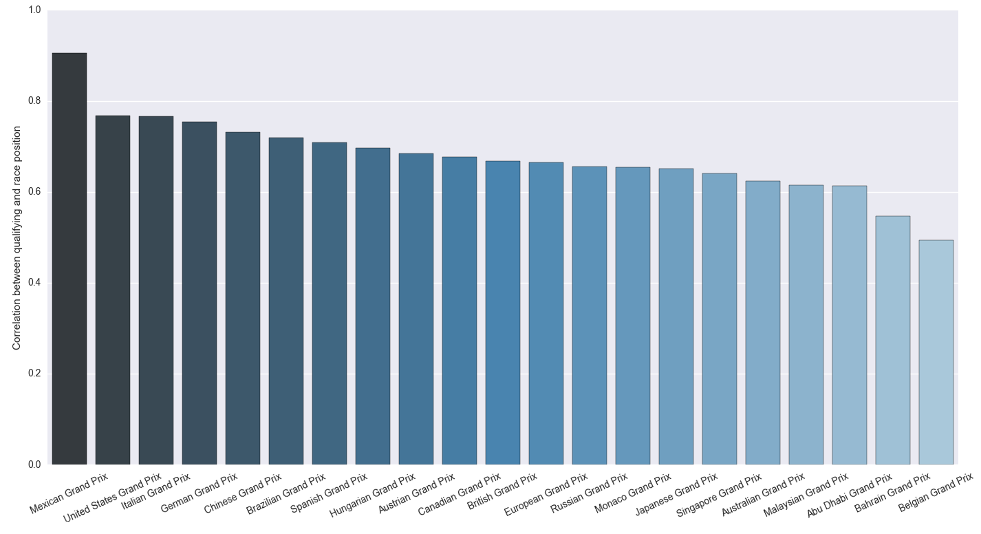
The idea behind the next graph was to see if there are some races where the starting position is a better indicator of the finishing position compared to other races. The chart shows the correlation between the starting and the finishing position of the drivers for each race held in these circuits since 2000.
It is amazing how far back Monaco GP is! This could be due to the many accidents you have there that result in changes in the finishing position. Australian GP, the first GP of the season, has one for the lowest correlations; probably because the cars are new and have glitches and the teams try to get accustomed to setting up their strategy (in case there are rule changes like this year). Mexico GP has been held just two times so let’s see if it stays in the top after this year’s GP. Belgian GP is the only one with correlation below 0.5; this could be due to the tricky weather conditions present in the Ardennes countryside.
The following chart shows the average finishing position of each driver to each of this year’s GPs. You can see that the drivers have some favourite and some less favourite circuits. For instance, Vettel is consistently better than Raikkonen except in the Belgian and Hungarian GPs.

Although the next plots do not provide any clear insights as the above ones, it’s interesting to see whether there is some latent structure in the data; something that distinguishes those who finish first from those who finish further back. In fact, I added those just because they are cool 🙂
Below is the two-dimensional representation of the dataset excluding the drivers’ starting and finishing position. Each point in the chart represents one driver in a race and its value (0 to 3) shows his finishing position. To make it clear, the starting and finishing positions of the drivers were not used when creating these 2D representations. They are only shown on top of them to facilitate visualization of the patterns. Specifically, the meaning of the the figures on the plots is as follows (the darker the better the result was for the driver):
- 0 -> driver finished on the podium
- 1 -> driver finished 4th to 7th
- 2 -> driver finished 8th to 14th
- 3 -> driver finished 15th or further back
Six dimensionality reduction methods were used, namely SVD, T-SNE, MDS, Autoencoder, Gaussian Random Projections and Sparse Random Projections.

As you can see, all methods identified some latent patterns in the data since there are clearly darker and lighter areas in all six plots. Even the random projections managed to capture patterns in the data. Although these points could be used as additional features to the model, I’m not currently using any of them.
Did you find the charts interesting or found something unexpected? Looking forward to your suggestions and ideas.
4 thoughts on “Building an F1 prediction engine – Feature Engineering Part II (continued)”
I found it small and little bit unreadable ).
Thank you very much!
Unfortunately I have not much time now to start my own model in Azure, and stuck in the react basics lessons now. Although slowly but surely I’m going for it. And your posts obviously pushed me to keep going.
In Chrome you can right click and then ‘open image in new tab’ to view a larger version of the charts. In Firefox, right click and ‘View image’.
I’m happy that my blog keeps pushing you 🙂
If you want to discuss any of your ideas in private, let me know and I’ll send you my email address. Maybe I could help you in setting this up.
Don’t worry, I just joking about image sizes ). Thank you for your words. Most probably soon I will ask you personally many questions about machine learning, I want to do it with R on Azure.