Formula One 2 Vec
You know what is the most geeky way to ‘prove’ that Alonso is the best F1 driver ever? It is Neural Embeddings! In this post I will try to give an intuitive explanation of what neural embeddings are, how they can be calculated and show some examples of how they capture semantic information about the objects they represent. In the end of this post, you will understand how all this relates to Alonso’s driving skills.
Inspired by the widespread use of word embeddings in NLP problems and the erroneous belief that Neural Networks (NNs) and Deep Learning (DL) cannot be used with tabular data, I started exploring the possibility of using DL models for making the F1 predictions. Although I have not (yet) used any DL model to improve these predictions, I gained a good understanding of what embeddings are and I was amazed by their great representational power.
What are these embeddings?
Let’s take the example of word embeddings. They are actually the distributed representations of the respective words. But what is a distributed representation?
The most common way to represent categorical variables like words – or in our case drivers, teams etc. – is by one-hot encoding (OHE) them. Each thing being represented is assigned a single representational element, that is, in a neural network, a single unit in the input or output layer of the networks. Conversely each unit is associated with only one represented thing. In a distributed representation, each thing being represented involves more than one representational element (unit in a neural network) – that’s why they are called distributed representations. Conversely each unit is associated with more than one represented thing. Instead of representing things, the units represent features of things.
The motivation of using embeddings is two-fold:
- First, if we have a large number of items, the dimensionality of each item when using one-hot encoding vectors can be huge. Consequently, a neural network would have many parameters to learn and require more data to be successfully trained. Moreover, the huge matrix multiplications can make the training and predictions slow. Mapping the item to a real valued vector of much smaller dimensionality instead of a huge one-hot encoding vector can help to solve this problem. An additional advantage of using embeddings is that if the number of items increases, the dimension of the embedding representation does not change.
- The second reason is that the one-hot encoding does not provide any semantic or similarity information about the input. By using effective methods we can represent item embeddings which contain semantic information about the item, which may help to increase the prediction performance as we are including additional information about the item.
How do they work?
Let’s use a specific task to make it clear what embeddings are and how they can be calculated. Let’s assume we want to build a classification model that given a pair of drivers and their features (as described in the feature engineering post), predicts which one will finish ahead of the other in a certain F1 race.
The names of the drivers can either be one-hot encoded or they can be ‘embedded’ to a lower dimensional space which is then given as input to the model. The benefits of doing the latter were described above.
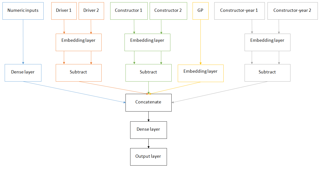
In practice, driver embeddings is just another layer in a neural network. The embedding layer (Keras documentation here) turns positive integers (indexes) into dense vectors of fixed size e.g. [[2], [5]] -> [[0.36, -0.2], [-0.5, 0.4]]. Therefore, all we need to do is to apply two steps before using it; turn our driver names into integers (e.g. ‘Hamilton’ will be substituted with the index 1) and choose the fixed size of the embedding vectors. That’s it. The size of the vectors is another hyper-parameter that has to be optimized. Put it another way, the embedding layer connects the OHE representation of the input with a smaller-sized layer. They weights between these layers form the input’s distributed representation.
This approach is schematically presented below assuming only a single driver is given as input for the sake of simplicity:

Let’s explain this a little bit. Assume we have 100 distinct drivers. Therefore, our input layer has 100 units. We set our embedding layer to have 10 units. The weight matrix between the input layer and the embedding layer has a shape 100 x 10 and is initialized randomly as the rest of the model weights. The model gets as inputs both the numeric features as well as the driver index and, as the model gets trained, the classification error is propagated back to all the layers of the network. The weights, including those of the embedding layer, are adapted in order to minimize this error. After the model has been trained, the first 10 weights of the embedding layer are the embeddings of the driver with index 1, the second 10 weights refer to driver with index 2 and so on.
It is clear from the diagram above that the model will try to optimize the embedding layer weights in a way that helps it lower the classification error of the model. However, this comes at the cost of increased complexity. If the driver names do not provide a significant increase in predictive accuracy and/or the data size is not large enough, the complexity of calculating 100 x 10 more parameters with the same amount of data may lead to a drop in performance since the model will not be able to learn all these extra parameters. As a result, a trial-and-error approach should be followed.
It is evident that the trained driver embeddings are now just a 100 x 10 weight matrix. You can copy it and use the same embeddings in other models, not necessarily NNs. For instance, you can replace the OHE of the drivers in an XgBoost model with the respective driver’s embedding.
What do embeddings actually capture?
The goal of this post is not to try to improve the F1-predictor model but to judge the representational power of the neural embeddings. Here’s what I did: I trained the classification model described above using not only the driver names, but also constructor names, constructor-year information and the GP name. Given all these features, the model should theoretically be able to factor-out the effect of a bad car on a good driver and be able to capture which driver/car is more capable of winning head-to-head battles regardless of the other parameters. The data include all F1 races since 1980. Below is how the final model looks like (ignoring some Dropout and Batch Normalization layers):
How can we understand what these embeddings capture given that they are very high-dimensional? Well, the solution is dimension reduction! We can take, for instance, the driver embeddings (20-dimensional vectors), reduce them into 2-dimensions and then plot them in a scatterplot. The most common way of doing this used to be T-SNE but the current best practice is to use UMAP since it offers many advantages like better preservation of the structure of the data, faster calculation times, variety of distance functions and support for supervised and semi-supervised dimension reduction.
Driver embeddings
Without further ado, below is the 2D representation of the F1 drivers embeddings:
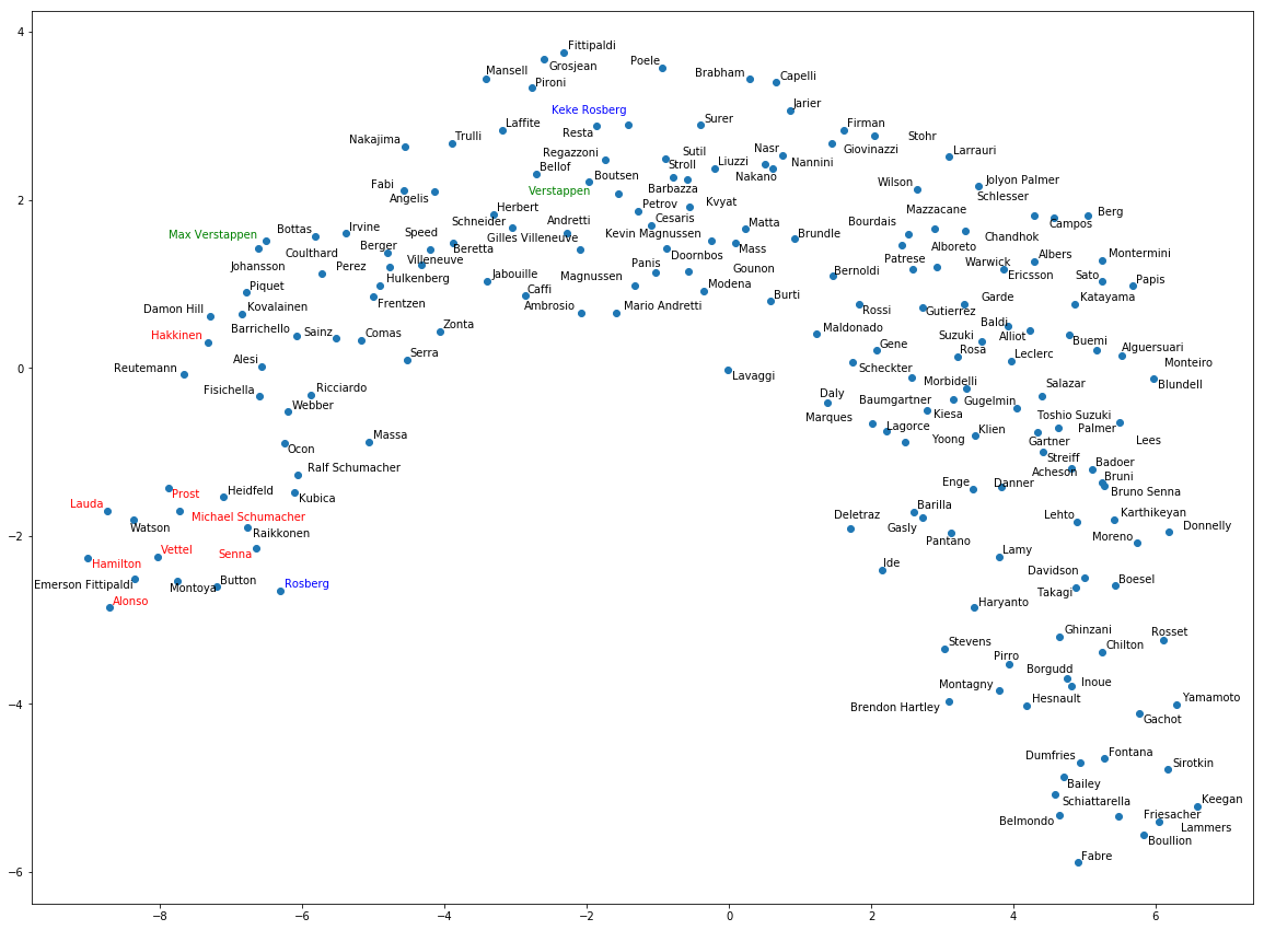
I have removed a few drivers for the sake of clarity. It is obvious that the neural embeddings have captured significant information about each driver’s skills since the most successful ones are on the left part of the plot. It is clear that the curve from the lower right, to the top middle and then back down to the mid left is the direction of ‘success’. And that’s why Fernando Alonso is the greatest driver ever (well… since 1980 at least)! He is in the tipping point of this ‘success’ representation.
For anyone curious, Alonso’s vector is:
[0.04003764, 0.25663805, 0.24401839, -0.21024074, 0.08636515, 0.17880611, 0.30798706, -0.292455, 0.00142352, 0.03305435, -0.180824, 0.1918052, -0.19863355, 0.2412251, 0.10490167, -0.19066837, 0.05080254, 0.21152733, -0.05678703, 0.24400114]
.
OK, this may not be a proof of anything but it clearly shows which drivers are capable of winning battles regardless of their car, circuit, their starting position etc. It is interesting that the current generation of leading drivers (e.g. Alonso, Hamilton, Vettel) are all on the leftmost part of the embeddings while the previous all-time greats such as Ayrton Senna, Michael Schumacher or Alain Prost are a little bit behind. It is also amazing to see drivers such as Montoya, Raikkonen, Kubica and Heidfeld being in this ‘elite’ group!
Behind that first group of drivers, we can see that the model successfully recognized those ones it thought were great but still not as extraordinary as the former ones. This list includes Ricciardo, Massa, Hakkinen, Damon Hill, Alesi and others. Surprisingly, Esteban Ocon and Ralf Schumacher also belong in this group. With green and blue you can see the Verstappens and the Rosbergs. In both cases, the sons are more successful than the fathers.
On the ‘unsuccessful’ part of the F1 drivers, the ‘top’ spot is taken by Pascal Fabre who started 14 races without gaining any points while we can also recognize the current F1 driver Sergey Sirotkin in that region. The almighty Taki Inoue is certainly on this list while other recent names include Max Chilton, Anthony Davidson, Brendon Hartley and Rio Haryanto. While the relative order inferred by the algorithm may not be perfect, no one can support that those drivers should had been more towards the left part of the plot.
Constructor embeddings
Going on to the constructors, let’s see their respective performance across all years since 1980 without taking into account any possible engine changes etc.

Again the 2D plot of the constructors’ distributed representations seems to have captured the performance of the teams across the years. Let me repeat what the embeddings capture. They try to identify which constructors were more capable of finishing ahead of another factoring-out all other parameters like drivers’ skills, starting position, championship position etc. That is, a team with ‘bad’ drivers that however manages to finish ahead of what its drivers’ skills would permit, would be shown higher up regardless of the position in the championship.
Following the description provided above, we can understand why Force India is so high up the chart. Going from left to right, we can see progressively stronger teams. The top team seems to be McLaren (forget the recent years) followed by Ferrari. Renault, Red Bull and Mercedes are all in this top category with the likes of Lotus F1 (now Renault), Williams, BMW Sauber and Brawn GP following.
It is remarkable that Spyker MF1, Spyker and MF1 (effectively the same team that raced under three different names) were all mapped to the same region. Effectively the model learned from the data that these ‘three’ teams were one and the same!
The usual suspects are found on the other side of the plot. Manor, Minardi, HRT are examples of teams that, apart from bringing in some talents to F1, did not contribute much to the spectacle.
Constructor-year embeddings
Since the constructor embeddings ignored the variations of each constructor across years, we can also plot the embeddings for each constructor-year. The number of all such teams is quite high and would make the plot illegible; therefore I semi-randomly selected few of them to show:
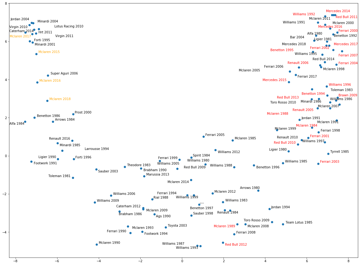
The case here is what you would expect. The embeddings have identified the best machinery and the greatest cars like Mercedes 2014, Red Bull 2011, Ferrari 2000 all hold the top spots in the top right corner of the plot. With red I have highlighted few of the most successful F1 cars as mentioned on motorsport.com.
Outside the championship-winning cars, McLaren 2000 and 2011, Bar 2004 and Bennetton 1992 have been identified as great cars. On the opposite side, the Virgins of 2010 and 2011, the 2011 HRT and the Minardis of 2001 (the one Alonso started his career) and 2004 are among the least-performing cars in F1 history.
I was amazed to see that the performances of the last four McLarens, and especially the 2017 car, are in the group of the abovementioned Minardis and Virgins. That’s how far behind Alonso’s cars were. And this is possibly why Alonso is so far ahead in the drivers plot; for he managed to finish ahead of many competitors with such a slow car besides winning races with much faster cars in his earlier days.
Grand Prix embeddings
Lastly, I also added the GP name of each race although that name may not refer to the same circuit in all cases. For instance, the ‘European GP’ has been held in several circuits but it still has a single name in the following plot:
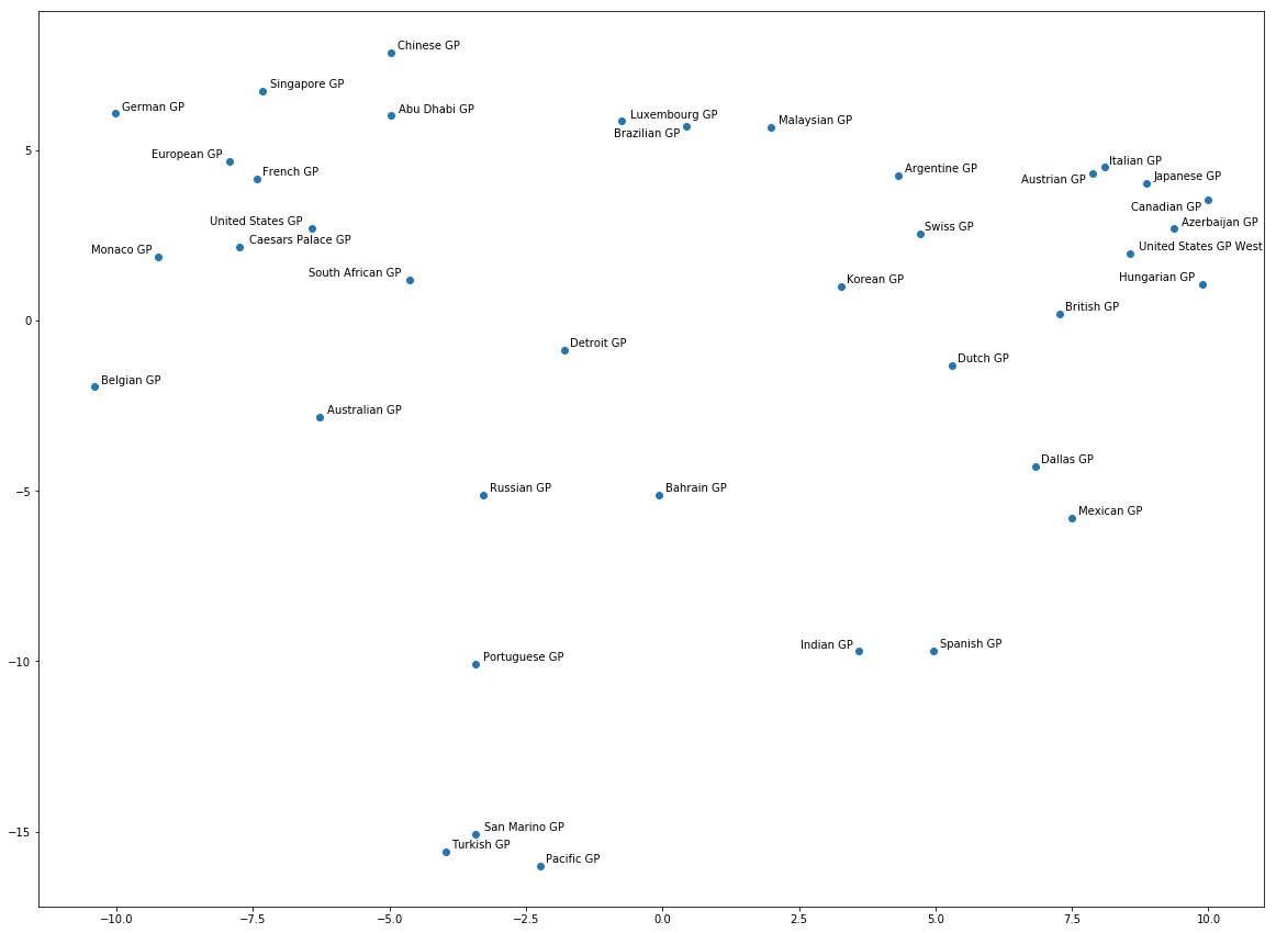
In this case, it is not very easy to interpret what the model came to learn. In theory, it should map circuits where drivers and cars have similar performances closer to each other. For example, I would expect to see street and narrow circuits (e.g. Monaco GP and Hungarian GP) next to each other although they are not. Given that the GPs refer to the past 38 years, this is difficult for me to explain what we see here. If you can identify any patterns, let me know.
The code for building the model and plotting the embeddings, a small subset of the dataset as well as the learned embeddings can be found on my github profile.
In this post I tried to give an intuitive explanation of neural embeddings, how they are trained and visually confirm their usefulness. I hope it is now clearer what they are and how they are used. Make sure to try them in your next ML challenge on categorical features of any tabular dataset and see if their visualizations make any sense and whether they improve the predictive power of your DL or classical ML algorithms.
Any comments are welcome! 🙂
5 thoughts on “Formula One 2 Vec”
The graph for the GP embeddings looks like the latest exiting invention on the drawing table of Hermann Tilke. The pattern is that certain corners or straights are named after existing circuits.
Haha that would be fun! Should I email Hermann Tilke and propose this idea?
Thank you for a wonderful post.
I have a comment about the first three scatter plots. To illustrate, I will discuss the driver embeddings 2d plot.
You mention that the curve goes from worst (bottom right) to average (top middle) to best (bottom left). This explanation treats the plot as a 1d projection on a line from worst to best. However, I think that the two first principal components encode more information than that.
I suspect that left-to-right encodes for a measure of average performance and bottom-to-top for variability. This suggests that bottom right is consistently poor performance, middle top is high variability of performance -perhaps high crash rates and high podium rates-, and bottom left is high performance with low variability of the performance.
You could test this hypothesis by correlating the standard deviation of drivers’ rank performance with their bottom-to-top (y-axis) principal component values.
If my explanation would be confirmed, then Alonso would indeed be the most consistent performer, but Hamilton would be the ‘best’ driver….
Thanks for your nice words!
Indeed, my comments treat the plot as an 1D projection.
Your interpretation makes sense and could well be true. You can see for example that Max Verstappen is good but relatively inconsistent and Alonso is very consistent (which both hold true in practice).
Do you see any other examples that make sense?